Problem: Initially the problem was a clunky UI design but upon further review and research, we decided on a complete overhaul of the system.
Goal: To create a white label classroom management system that removes existing hiccups instructors experienced in conducting assessments (placement and classroom). The goal revised to include the merger of two assessment systems into one ultimately creating a Godzilla of a project and the project scope multiplied ten folds.
Role: I conducted research and suggested a reframing of the problem. My research suggested the UI was not the only issue. I then spearheaded the design strategy, ideation, user flows, wire-framing, design system and prototyping.
Disclaimer: Due to the massive scope of the project, it is still under development and not all information can be shared here.
James needed a quick redesign of the clunky UI of the elearning system.
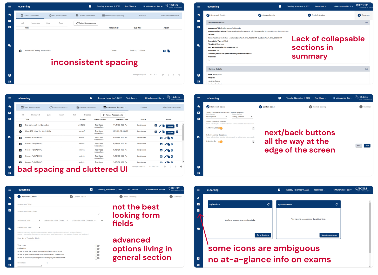
Issues with the current system
Aimed to simplify the assessment creation process, remove non-essential features, and add UI for admin tools and managing grades both of which were previously only possible thru SQL database.
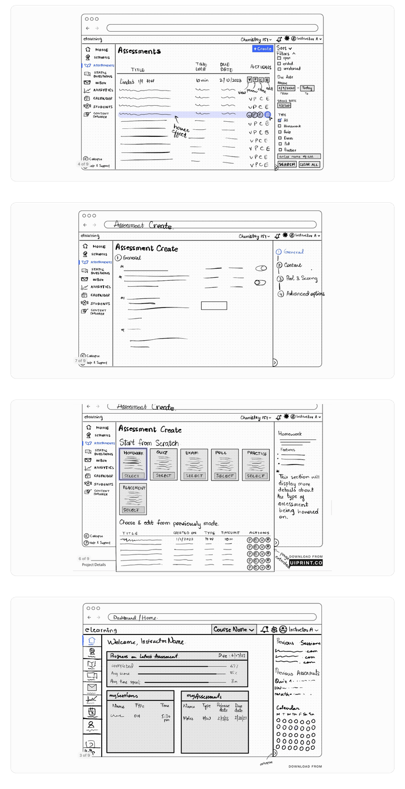
Early Sketches
We were building a product that could be easily used by non-power users who don't have coding knowledge or SQL skills. To remove friction in the exam creation and eradicating the need to contact support or dev team to make general changes to the assessments or scores or admin roles and permissions.
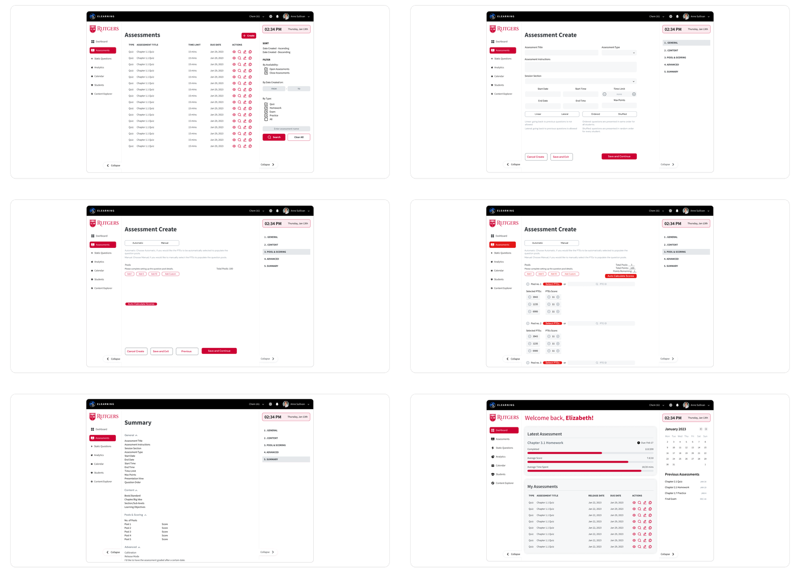
Clear CTAs with improved user flow and filtering/sorting options. Inclusion of recognizable iconography, clear copy and consistent UI
Initial Designs
Added Complexity: I'm told we're fusing another platform that only assessed placement exams into the current elearning system (which is a full classroom system). The new system was meant to run on AWS and Angular 14.
Elearning was currently running on Azure and Angular 12 while placement ran on Azure and Angular JS. This added complexity made it harder to understand how many, what kind of apps we were trying to build. After a few more meetings with James and Olivia to understand how the two systems worked and failing to do so. I decided to test them myself to understand how combining the two systems together would work for students as well as the professors. Not to mention the similar naming made it an absolute nightmare and added to my confusion.
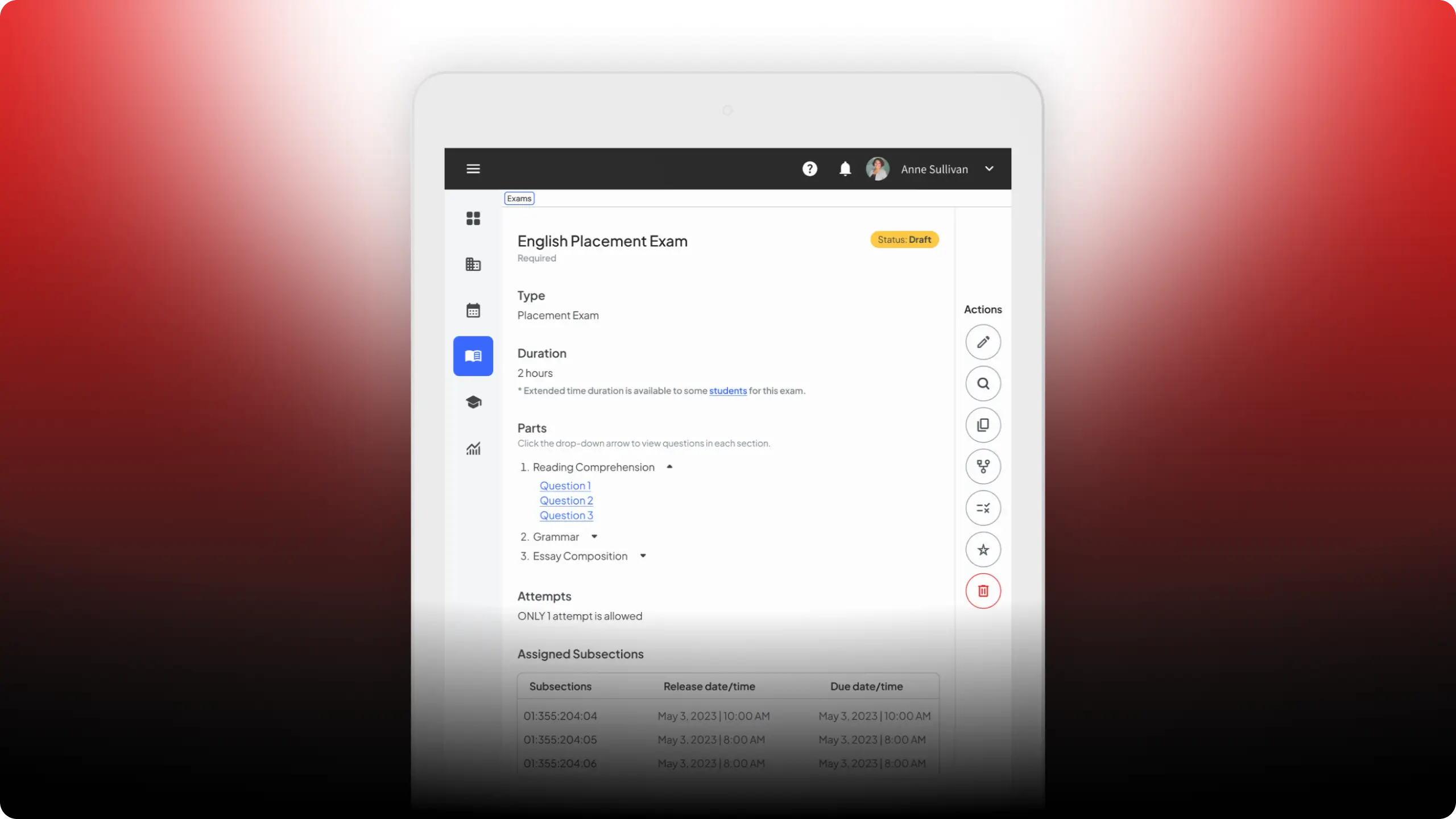
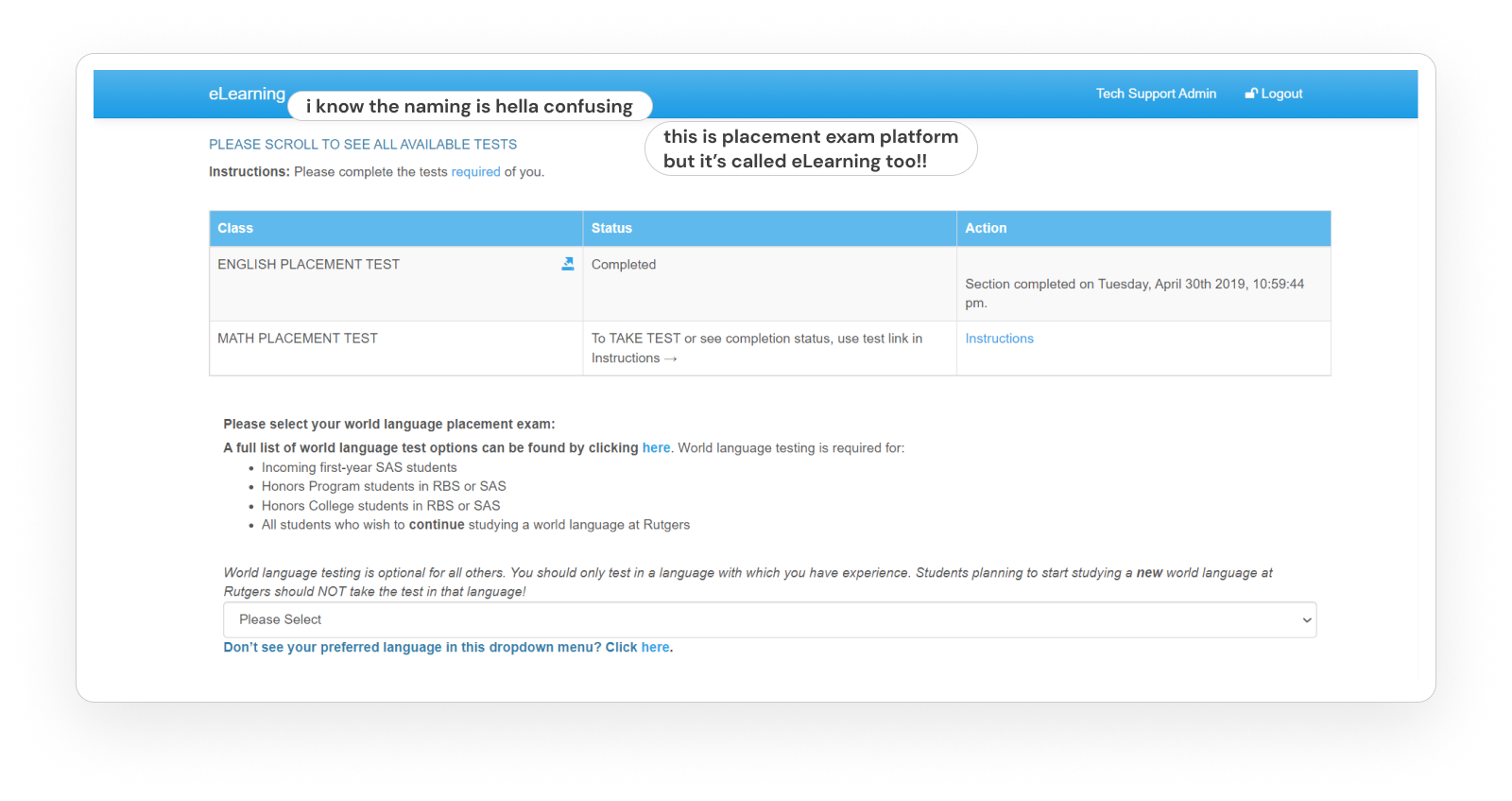
The existing Placement Exam Platform (it was also called eLearning)
THE SOLUTION
I tested the elearning and placement exam system by myself, both as a student and as a professor.
Userflows tested as a Student: Taking an exam, quiz, HW, on elearning platform Taking an exam on the placement exam platform Navigating the elearning platform Navigating the placement exam platform Search for exams, assignments, quizzes, HWs available to me as a student on elearning Search for placement exams available for me to take as a student
Userflows tested as a Professor: Creating an exam, quiz, HW, on elearning platform Navigating the elearning platform Search for exams, assignments, quizzes, HWs that have been released to the class to take. Looking at past assessments that have been administered. Placement exam platform didn't have a UI for creating an exam or scoring it so certain userflows couldn't be done.
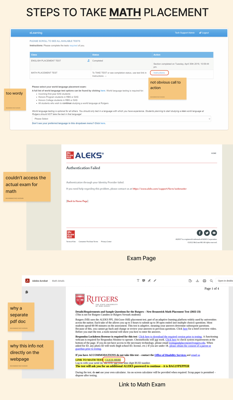
Userflow to take the Math Placement Exam
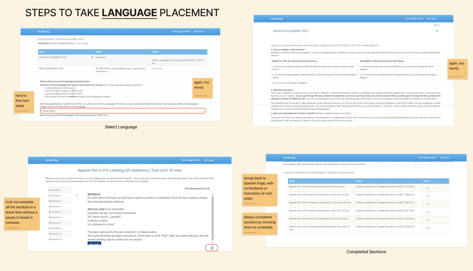
Userflow to take a Language Placement Exam
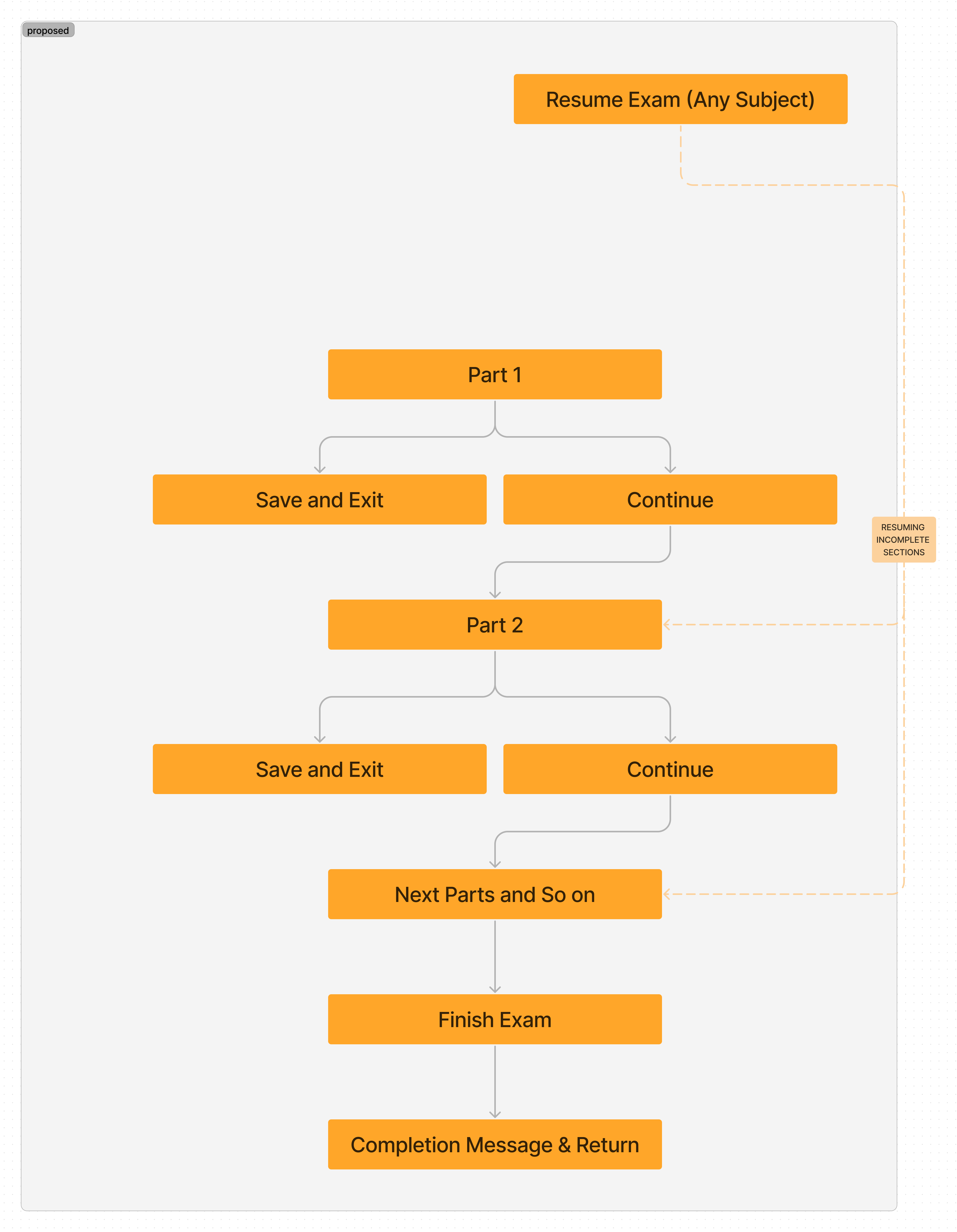
Proposed flow of an Exam for students
I suggested doing more research to understand the current user pain points and goals of the new MVP.
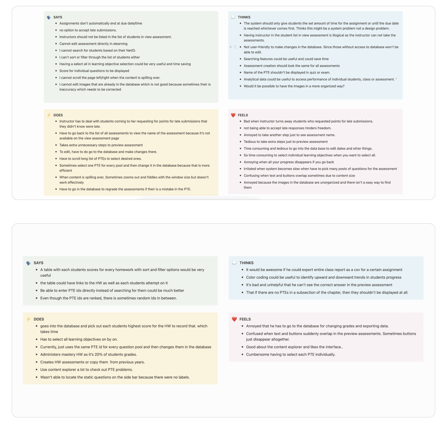
I conducted interviews with two heavy users (professors) of the eLearning platform (the classroom system) and outlined my findings in a report. The chem professor made annotations to point out her friction points and recommendations for the new system.
Annotations from chemistry professor on current eLearning system
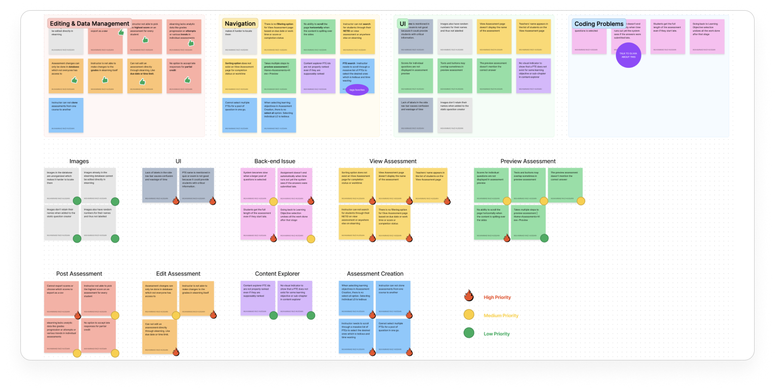
Presented the research findings and empathy maps from the interview to James and proceeded to affinity diagram with Aditi
Comprehensive overview of all the problems and potential improvements
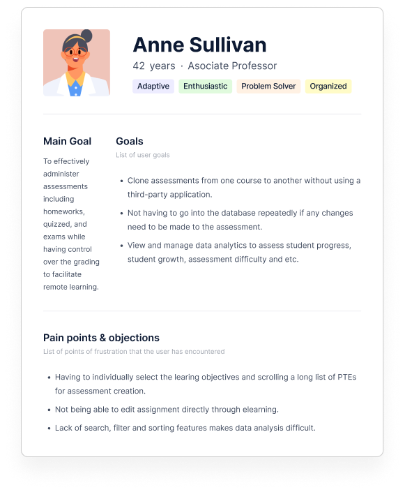
Putting my self in the shoes of the user
Ideal User Person for an instructor or admin level user.
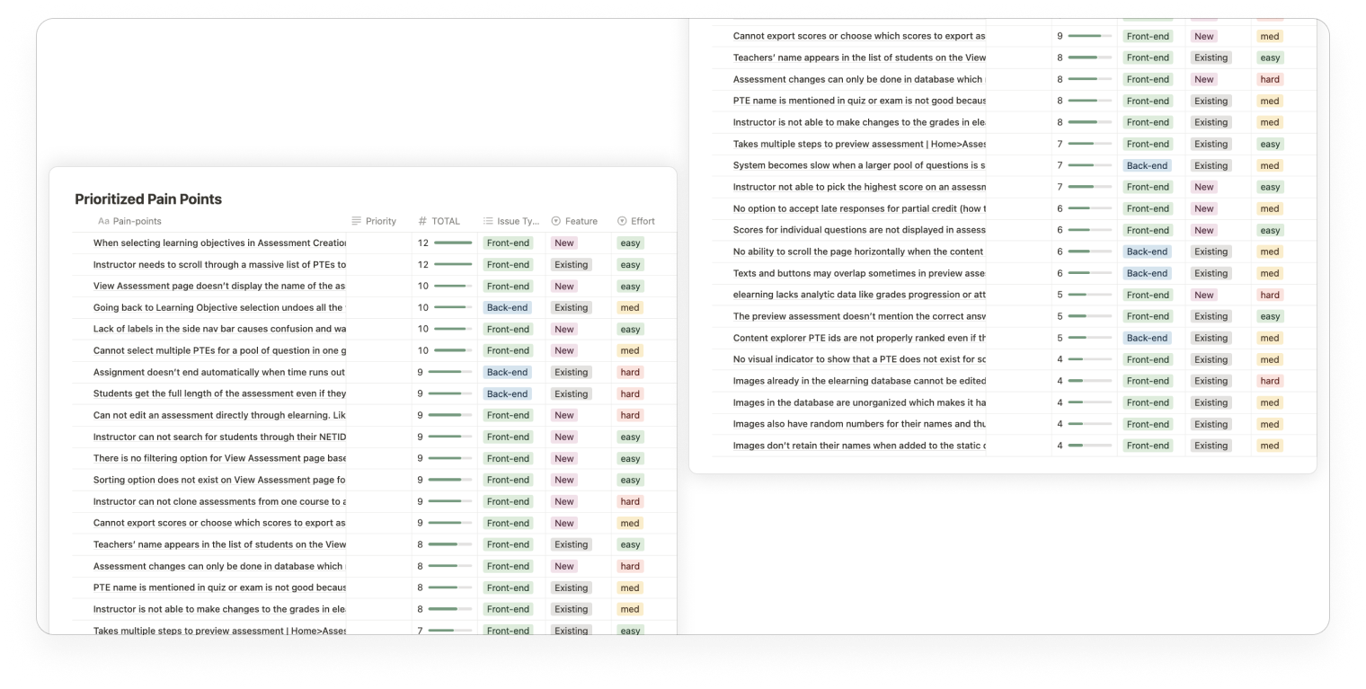
Prioritizing pain points to cut down on development time for MVP
Prioritization Table
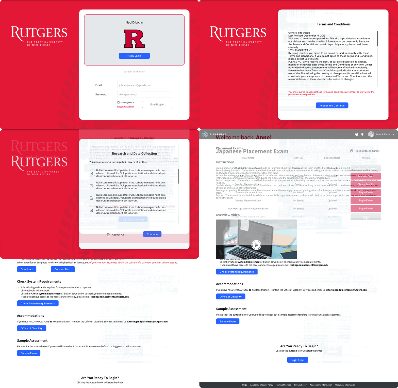
Student Version - Cut down on a lot of text heavy home page and streamlined the userflow to take an exam. Marked the exams available to take with a clear CTA button and other disabled actions greyed out
We cut down a lot of the fluff from the original design and made it more simpler. The main goal was to allow students to quickly and easily get to the placements exams. Students were to login directly through their NETID. The main function we encouraged was to take the exam or resume an existing one.
Placement Assessment Tool - Student
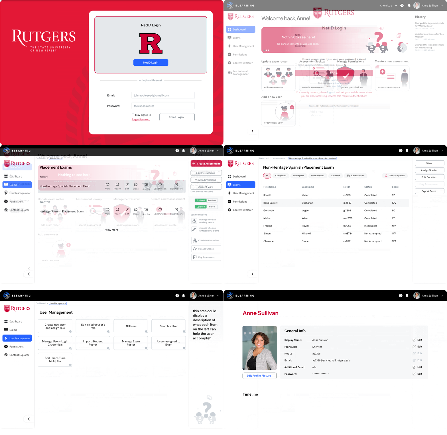
Professors and Admin Version - removed a lot of the unnecessary information from the home. Keep the most used actions on the dashboard and added a history section on the side bar.
I created a 3-panel design where the center panel was the main workspace, the left panel was for the navigation and the right one was the dynamic panel that would contain functions and actions depending on the content of the main panel.
Placement Assessment Dashboard - Professor
A responsive and dynamic 3-panel design solution that allows professors to easily create, score and manage assessments. Admin level users can easily manage their admin settings, roles, permissions and etc. And it all happens without the user needing knowledge of SQL or any other coding language.
The design I created was modular and it can easily be adapted for other tools that are to be implemented later down the line including the Content Explorer, Adaptive Assessments, Problem Templates and User Management tools. I had created a comprehensive design system to help development remain consistent when I handed over the project upon my graduation.
OUTCOME
What impact did I leave upon handing the project over
Before leaving, I helped the team with my replacement. I interviewed three candidates for my role and ended up hiring two of them. I trained them and transferred all my knowledge through meetings and working together in the file. I made sure they fully understand the scope of the project and our current status. I also transferred the ownership of the file to the Product Owner. This ensured a smooth and successful handoff to the upcoming designers upon my graduation.
Next Steps
1. Firstly, several other tools need to be designed and developed before an MVP is complete; content catalog, exam scoring system, user management, role and permissions, adaptive assessments are just a handful of them.
2. While the design and development of these tools is being done, they need to continually be tested for functionality and efficiency.
3. Gaining feedback is crucial. The designers should iterate quickly and often to build the best possible product.
4. Lastly, once an MVP is created, testing it with a sample of professors and students is vital to test its robustness, ensuring it works for different courses.