View
project
Pipeline Initiative
Lowering the barrier to political participation
overview

Aspiring political candidates face a frustrating barrier: finding which offices they're eligible to run for requires hours of research across confusing government websites. As Lead Designer, I created the designs for an embeddable web widget that transforms this complex process into a simple 30-second search.

The tool collects just three pieces of information (email, address, election year), then uses census block mapping to match users with available positions across federal, state, county, and municipal levels. Designed as a white-label solution, it's now deployed across 6 partner organizations of Pipeline Initiative, each seamlessly customized to their brand.

Timeframe

July 2025 - Aug 2025

industry

Policy Advocacy / Public Affairs

team

Myself - Lead UX Designer

Angie - Project Manager

Yanik - Creative Director

Scott - Senior Developer

Nick - Lead Developer

Delivered

Hi-fi prototypes for the web widget

FAQ and contact forms

PROBLEM
How do you lower the barriers to political participation when finding the right office to run for requires navigating complex, fragmented government data?

Aspiring political candidates, especially first-time candidates from underrepresented communities, face a daunting challenge: determining which offices they're eligible to run for requires piecing together information across multiple confusing government websites, understanding complex district boundaries, and tracking constantly changing filing deadlines.

THE SOLUTION
An embeddable political recruitment tool that transforms hours of research into a 30-second search

I designed a white-label web widget that matches aspiring candidates with available elected positions through precise address-to-office mapping, deployable across multiple partner websites while maintaining data accuracy across federal, state, county, and municipal levels and seamlessly match to each organization's unique brand identity.

Designing for complex data hierarchy
  • Split column layout for scannable list of results on left panel and detailed info about position on the roght panel.
  • Multi-level filtering system: office level (local, township, county, state), alphabetical order, filing deadlines
  • Comprehensive detail view including eligibility, deadlines, salary, current officeholder, and filing instructions.
Choosing embeddable widget over popup
  • Pivoted from popup concept to embedded widget to avoid ad blockers and popup blockers
  • Enabled seamless white-label customization for partner branding
  • Created trust by keeping users on partner's website rather than redirecting

Solving mobile responsiveness challenges
  • Adapted split-screen layout for small screens without losing data hierarchy
  • Maintained sorting/filtering functionality while optimizing for touch interactions
  • Ensured address input and validation worked seamlessly on mobile devices

Building trust through transparency
  • FAQ link for common questions about the process
  • Data correction form for user-reported inaccuracies
  • Clear attribution to BallotReady data source
  • Visible data scope limitations (offices through 2030, cities 15,000+)

Technical considerations that shaped design
  • Designed around census block conversion and BigQuery processing
  • Created error states if address/year search combination fails to fetch data.
  • Accommodated monthly data refresh cycles in user communications
OUTCOME
Impact

Successfully deployed across 6 partner organizations (and counting). What previously required hours of research across fragmented government websites now takes 30 seconds.

The tool can deploy across unlimited partner platforms while maintaining accuracy through automated monthly updates.

Reduced barriers to political participation in first-timers runners and people from under-represented communities to improve democratic representation.

Key Takeaways

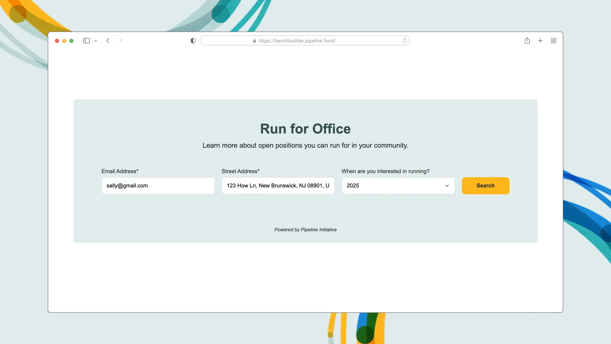
1. Low barriers beat data collection: Three fields (email, address, year) maximized engagement. Collect more data later through the "I'm Interested" funnel.

2. Embeddable beats popup: Avoided ad blockers, built trust by keeping users on partner sites, and enabled true white-label customization.

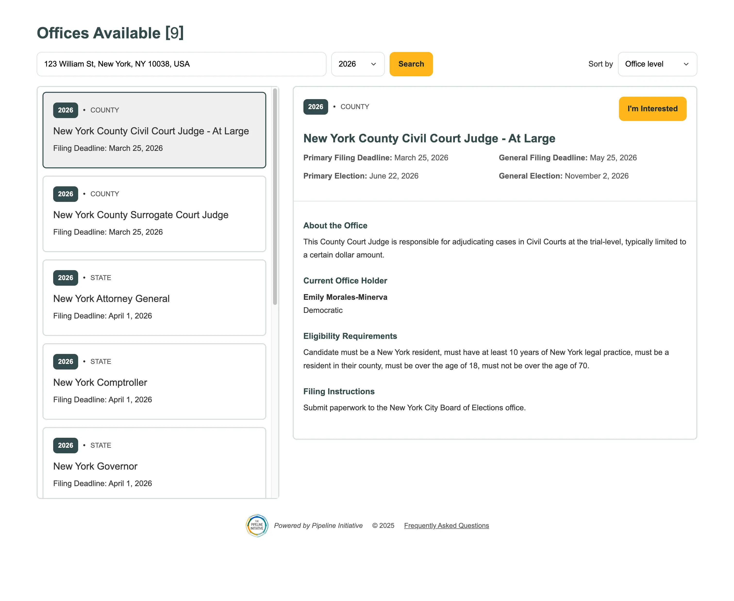
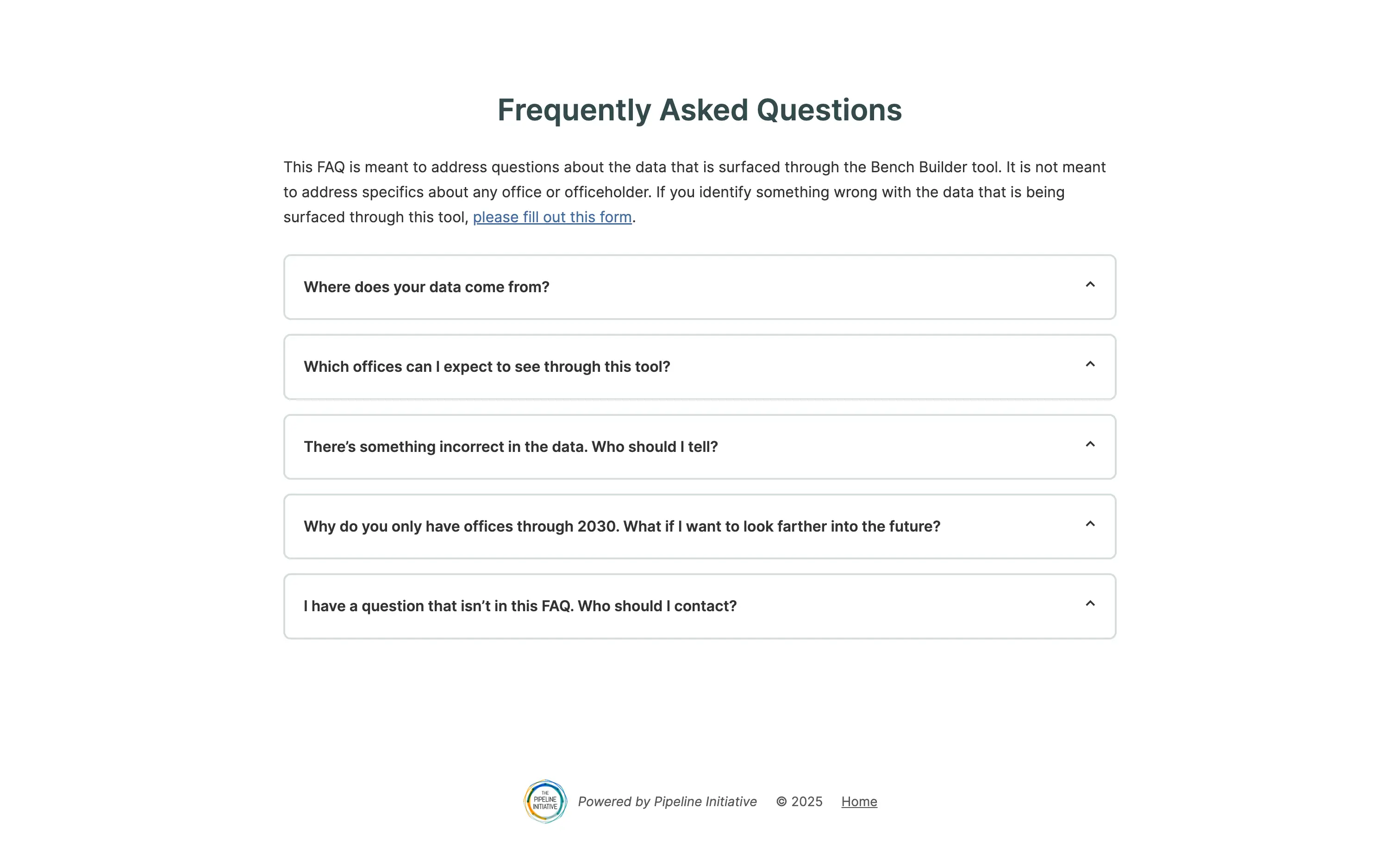
3. Design for edge cases: FAQ links, data correction forms, and transparent limitations (cities 15,000+, offices through 2030) built user trust.

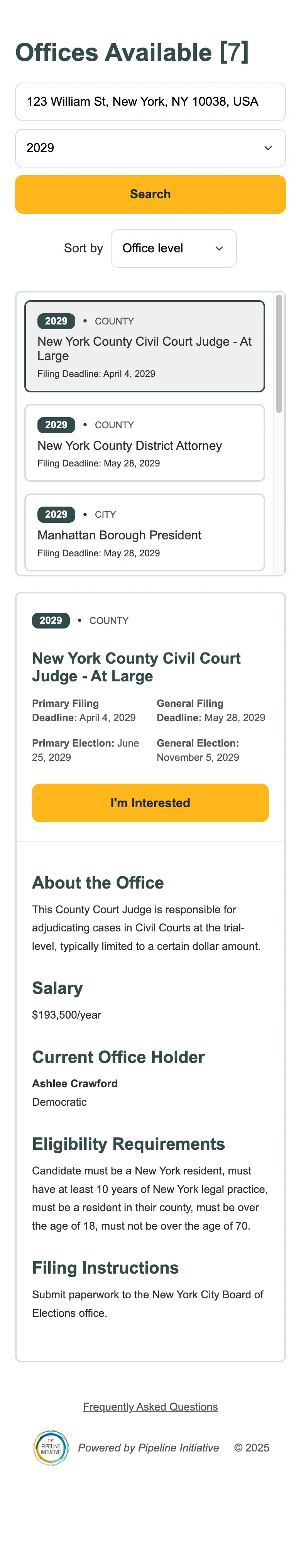
4. Mobile required rethinking hierarchy: The desktop split-screen couldn't just shrink. Had to reimagine how users navigate complex data on touch devices.

5. Design for hope: Every decision—from reducing friction to providing complete information—was about empowering people to see themselves as viable candidates.